


Mobile-First Design: Why It's Non-Negotiable in 2025
Over 60% of web traffic is mobile. If your site looks like an afterthought on a phone, you're losing customers every day.
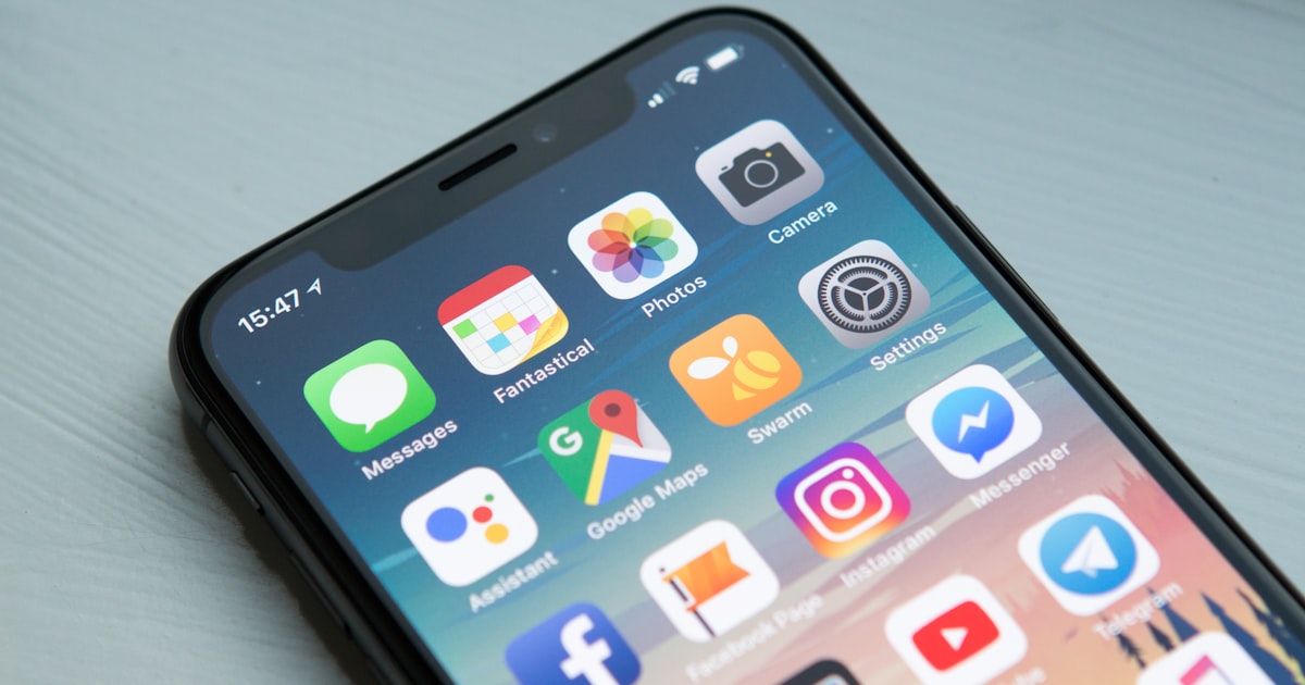
It's 2025 and I still see business websites where the mobile version is clearly an afterthought. Tiny tap targets, text in 14-pixel grey-on-grey, hero images that fill the entire phone screen. If that sounds like your site, you're losing customers — and Google notices too.
What "mobile-first" actually means
Mobile-first isn't just "responsive". It's designing the small-screen experience first, then expanding outward. The constraint forces you to be ruthless about what matters: what's the one thing this page exists to do? Lead with that.
The five mobile UX rules I never break
- Tap targets at least 44×44px. Apple's guideline, and it's right.
- Body text 16px minimum. Anything smaller forces zooming, kills reading flow.
- Sticky CTAs on long pages. Don't make people scroll back up to convert.
- One-thumb navigation. Critical actions should reach without grip-shifting.
- Forms with fewer than 5 fields. Every additional field drops conversion by ~10%.
The performance side of mobile-first
Mobile users are often on slow networks. Performance budgets matter:
- Total page weight under 1 MB on first load
- Largest Contentful Paint under 2.5 seconds on 4G
- No render-blocking JavaScript above the fold
If you can't say "yes" to all three, mobile users are leaving before your site even loads.
Common mobile-first mistakes
Even when teams try, they trip over the same patterns:
- Hero sections that take 100vh, hiding all the actual content
- Hover-only interactions that don't translate to touch
- Carousels with arrows too small to tap accurately
- Modal dialogs without a clear close button
How to audit your own site in 5 minutes
Open your site on your phone, set a 3-minute timer, and try to do whatever your "primary action" is — book a call, place an order, find a price. If it takes longer than 30 seconds or requires zooming, your mobile experience needs work.
Want a fresh pair of eyes on your mobile UX? Get in touch for a quick audit.
