

Web Typography: Choosing Fonts That Look Good and Load Fast
Type is most of what a visitor sees. A practical guide to picking, pairing, sizing, and loading fonts without wrecking your performance.

Strip the images off almost any website and what remains is type. It carries the tone, the hierarchy, and nearly all of the content — and it is the first thing that makes a site feel considered or careless. It is also, handled badly, one of the heaviest things on the page.
Two families is usually the answer
One for headings, one for body text. A third has to justify itself. The reliable pairing formula is contrast in structure but agreement in mood: a geometric sans for headings with a humanist sans for body, or a high-contrast serif for headings with a neutral sans below. Two faces from the same superfamily is the safest option of all.
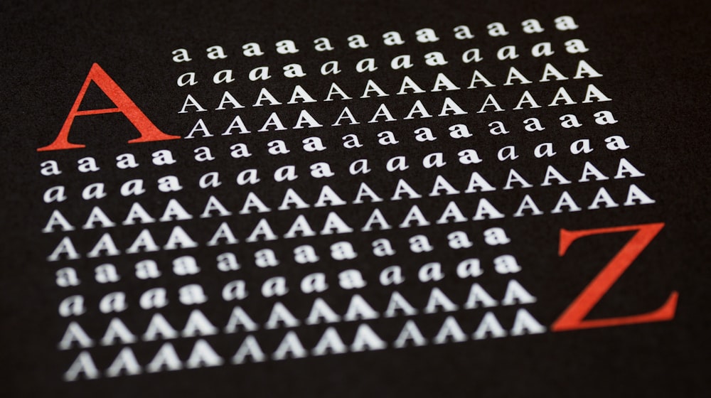
Body text: get these four numbers right
- Size: 16px minimum, 17–19px is more comfortable for long reading.
- Line height: 1.5 to 1.7 for paragraphs, tighter for large headings.
- Line length: 60–75 characters. Set
max-width: 65chand stop guessing. - Contrast: at least 4.5:1 against the background. Grey-on-grey body copy is the most common accessibility failure I find, and it is covered in why accessibility is not optional.
Build a scale, do not pick sizes
Choose a ratio — 1.25 for calm, 1.333 for editorial, 1.5 for bold — and generate your sizes from your body size. Five or six steps is plenty. A scale is what makes a page look designed rather than assembled, and it removes the argument about whether that heading should be 26 or 28 pixels.
Use variable fonts
A single variable font file covers every weight from light to black, often in fewer bytes than three static weights. That is the rare change that improves both design flexibility and load time. If you are only shipping regular and bold, static files are still fine — just do not load eight weights and use two.
Self-host, and preload the critical face
Third-party font hosting adds a DNS lookup, a connection, and a privacy consideration. Self-hosted WOFF2 with a preload hint on the face used above the fold is faster and simpler:
<link rel="preload" href="/fonts/inter-var.woff2" as="font" type="font/woff2" crossorigin>
Preload only what renders immediately. Preloading everything is the same as preloading nothing.
Control the swap
Use font-display: swap so text is readable while the font arrives, then reduce the reflow by matching your fallback's metrics with size-adjust, ascent-override, and friends. That combination is how you avoid both invisible text and a jarring jump — both of which show up in the layout shift metric described in the Core Web Vitals guide.
Details that separate good from fine
- Tighten letter-spacing slightly on large headings; loosen it on all-caps labels.
- Use real punctuation — curly quotes, en dashes, non-breaking spaces before units.
- Enable
font-feature-settingsfor tabular numbers in tables and pricing. - Never justify text on the web; ragged right beats rivers of white space.
- Cap heading widths so a two-line headline does not become four on a laptop.
Licensing, briefly
Open licences such as SIL OFL cover self-hosting and commercial use. Commercial foundry licences are usually priced on monthly pageviews and often forbid self-hosting the raw file. Check before you ship a client site — it is a genuinely awkward email to send later.
Want your type to carry more of the brand? Get in touch, or see how it plays out on recent projects.