

Colour Theory for Web Design (Without the Art School Detour)
How to build a website palette that looks intentional, stays accessible, and survives contact with a real design system.
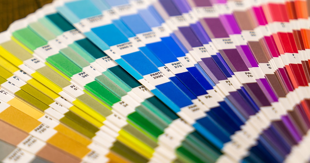
Most website palettes are chosen the same way: someone picks the brand colour, someone else adds a colour they like, and the rest arrives by accident. Then six months later nobody can say which grey is the right grey. A palette is a system, and the system is not complicated.
You need fewer colours than you think
A complete, professional website palette is usually:
- One primary — your brand colour, used for primary actions and little else.
- One accent — used sparingly for highlights and emphasis.
- A neutral ramp — five to eight steps from near-white to near-black, doing 80% of the work.
- Four semantic colours — success, warning, error, info.
That is it. Every extra hue is another decision your team has to get right forever.

The 60-30-10 split
Roughly 60% of the page should be your dominant neutral, 30% a secondary surface tone, and 10% your primary and accent combined. When a site feels loud, the ratio is almost always wrong rather than the colours being wrong. Brand colour everywhere means brand colour nowhere — nothing stands out because everything does.
Use a perceptual colour space
Generating tints and shades by adjusting HSL lightness gives you steps that look uneven, because HSL does not match how eyes work. Modern CSS supports oklch(), which does. Build your ramp in OKLCH and the steps feel evenly spaced, which is exactly what a design system needs.
Contrast is a requirement, not a preference
Body text needs 4.5:1 against its background, large text and UI components 3:1. Check the states people forget: placeholder text, disabled buttons, focus rings, text over images, and your own brand colour used as a text colour — mid-tone brand blues fail against white constantly. This is the same ground as why accessibility is not optional.
Never rely on colour alone
A red border on an invalid field is invisible to a good share of your audience. Pair colour with an icon, a label, or a text message. Same for charts, statuses, and required fields.
Name colours by role, not by appearance
Tokens named --surface, --surface-raised, --text-primary, --border-subtle survive a rebrand. Tokens named --blue-500 or worse --light-grey-2 do not, and they are what makes a dark mode painful to retrofit — the exact trap discussed in designing a dark mode properly.
Test it in context
Swatches on a white artboard lie. The same orange feels warm next to cream and radioactive next to charcoal. Judge a palette on a real page, at real sizes, with real photography, on a cheap laptop screen as well as a good monitor.
A workable process
- Start from the brand colour you are stuck with.
- Build the neutral ramp first, slightly tinted toward the brand hue so it feels related.
- Pick one accent that clears contrast against both your lightest and darkest surfaces.
- Add semantic colours, adjusted to sit within the palette rather than default browser red and green.
- Write it down as tokens before anyone builds a component.
Do this and your colour decisions stop being opinions. Skip it and you get the drift described in how generic themes damage a brand.
Need a palette that works across a whole site rather than one mockup? Let's talk.