
Web Design Trends in 2026 (And Which Ones Are Worth Your Money)
Every year brings a fresh crop of design trends. Here are the ones that genuinely help a business site in 2026 — and the ones to skip.
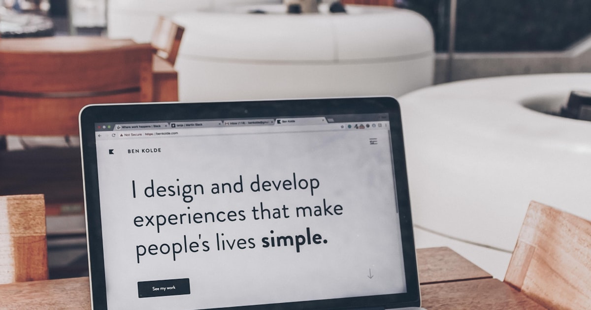
Trend lists are easy to write and expensive to follow. Most of what gets labelled a "2026 trend" is a portfolio piece that would quietly hurt a real business site. So here is a filtered version: what I am actually building for clients this year, what I am talking them out of, and why.
Worth it: restraint as a design decision
The strongest sites I have shipped this year have fewer sections, fewer fonts, and fewer effects than their 2023 equivalents. Confidence reads as quality. A single well-set headline with generous spacing outperforms a hero stuffed with badges, counters, and three competing buttons. If you want the mechanics behind that, I broke it down in why white space makes a site feel expensive.
Worth it: big, opinionated type
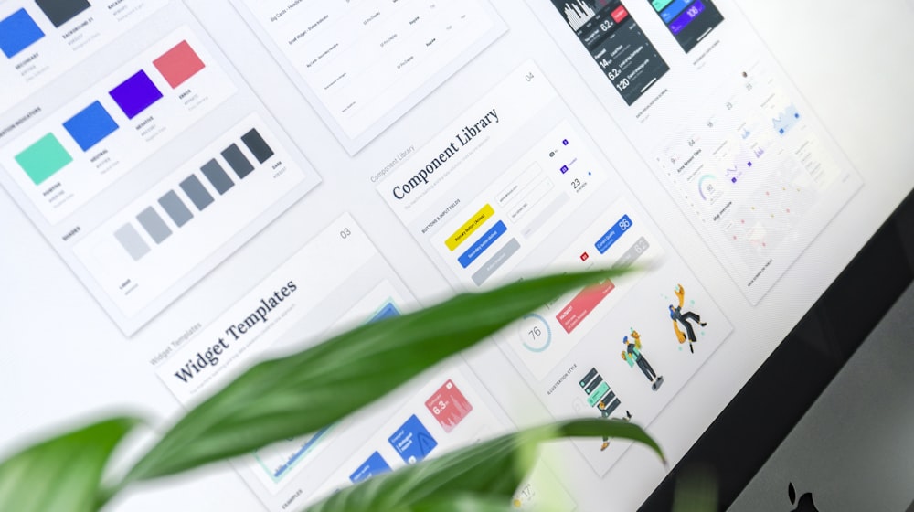
Type is doing the heavy lifting in 2026. Oversized headings, tight tracking, and a real typographic scale give a site personality without adding a single kilobyte of imagery. Variable fonts make it cheap in performance terms too — one file, every weight. More on picking and pairing faces in my web typography guide.
Worth it: motion that explains something
Animation earns its place when it communicates state, hierarchy, or cause and effect. A button that acknowledges a press, a panel that slides out from the element that opened it, a number that counts up as its section enters view. Decoration for its own sake is the version to skip. See micro-interactions for where the line sits, and GSAP vs Framer Motion if you are choosing a library.
Worth it: dark mode done properly
Dark mode has stopped being a novelty and started being an expectation, particularly for anything developer-facing or product-led. Done badly it is unreadable; done well it is the version most people keep. The pitfalls are specific and avoidable — I list them in designing a dark mode that does not hurt to read.
Worth it: honest performance budgets
The most valuable "trend" of 2026 is treating page weight as a design constraint from the first wireframe rather than a cleanup task before launch. Deciding up front that the homepage ships under 1 MB changes which hero you choose, which font you load, and which library you reach for. If your current site is already struggling, the ten most common performance mistakes is the fastest place to start.
Skip: full-screen scroll hijacking
Taking over the scroll wheel to move between full-viewport panels still shows up in awards galleries. It also breaks keyboard navigation, confuses trackpad users, wrecks accessibility, and buries the content that search engines and buyers both want. If your site has a conversion goal, do not do this.
Skip: AI-generated hero imagery on trust-led pages
Generated illustration is fine for abstract backgrounds. It is a poor choice for anything a customer uses to decide whether you are real — team photos, premises, product shots, case studies. Buyers spot it, and the credibility hit costs more than the stock licence you saved.
Skip: a design language you cannot maintain
Bespoke layouts on every page look great in the mockup and collapse the moment a non-designer needs to add a page. Build a small set of reusable sections and let the content vary. That is also the difference between a site that stays sharp for three years and one that drifts — the trap I described in how generic themes quietly damage your brand, in reverse.
How to actually decide
Run every trend through three questions: does it help someone understand what we do, does it help them act, and can my team maintain it without me? Anything that fails all three is a portfolio piece, not a business decision.
Planning a build or a refresh this year? Tell me what you are working on and I will tell you straight which of these are worth your budget.