

Micro-Interactions: Small Details That Make a Site Feel Alive
The difference between a site that feels flat and one that feels responsive is usually a handful of 150-millisecond details.

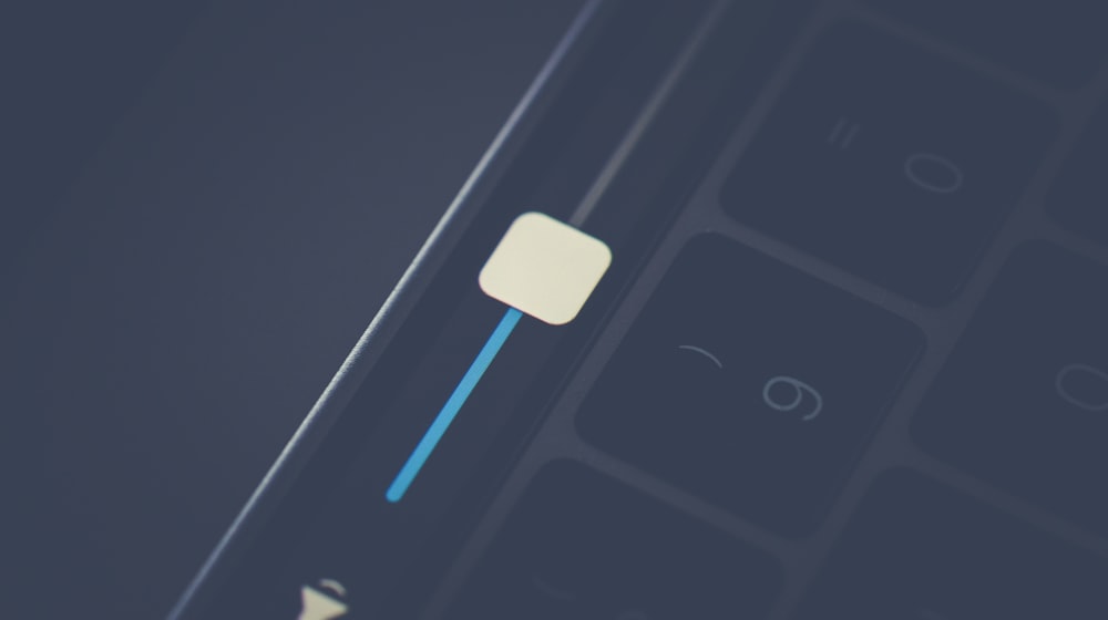
A micro-interaction is a tiny piece of feedback tied to a single action: the button that dips when pressed, the field that acknowledges valid input, the toggle that slides rather than snaps. Individually they are trivial. Collectively they are most of what people mean when they say an interface feels good.
Every micro-interaction answers a question
Did that register? Is it working? Did it succeed? Where did that come from? What happens if I click this? Interfaces that feel dead are usually interfaces that leave those questions unanswered, so users click twice, submit twice, and lose confidence.
The ones worth building first
- Button press feedback. A 100ms scale or shade change on
:active. Cheapest win on this list. - Loading state on submit. Disable the button, swap the label to "Sending…". Prevents duplicate submissions and the "did it work?" refresh.
- Inline validation. Validate on blur, not on every keystroke, and confirm success as well as failure. More in form UX.
- Hover intent on cards. A subtle lift and image scale makes a grid feel clickable without adding a single word.
- Skeletons over spinners. A shape that matches the content that is coming feels faster than a rotating circle, even at identical timings.
- Visible focus states. Not decoration — a requirement, and part of the accessibility baseline.
Timing is the whole craft
Under 100ms reads as instant. 150–250ms is the sweet spot for most UI transitions. Anything over 400ms starts to feel like waiting. Use ease-out for things entering (fast then settling) and ease-in for things leaving. Never animate a state change someone will trigger repeatedly with a long duration — it turns pleasant into annoying by the fifth click.
Animate the cheap properties
Stick to transform and opacity. Animating width, height, top, or margin forces layout recalculation on every frame and drops frames on mid-range phones. If you are picking a library rather than writing CSS, GSAP vs Framer Motion covers the trade-offs.
Respect reduced motion
Some people get motion sickness from parallax and large transitions. Wrap non-essential motion in @media (prefers-reduced-motion: reduce) and fall back to instant state changes. Keep the feedback, drop the movement.
Where it tips into annoying
- Scroll-triggered reveals on every element, delaying content people are already reading.
- Animated counters on statistics nobody asked to watch count.
- Page transitions that add 600ms to every navigation.
- Hover effects that shift layout and make people chase a target.
The test is simple: does this help someone understand or act? If it only exists to show that you can, cut it. That is the same filter I apply to trends in web design trends for 2026.
Do not let polish cost you speed
Motion libraries are convenient and rarely free. Check what a library adds to your bundle before committing, and prefer CSS where CSS is enough — the kind of decision that decides whether you pass the thresholds in Core Web Vitals.
Want the polish without the bloat? See how it looks in practice or get in touch.