

12 Shopify Product Page Changes That Lift Conversions
Twelve practical Shopify product page changes, from galleries and variant pickers to shipping details and sticky mobile buttons, that turn interested visitors into orders.
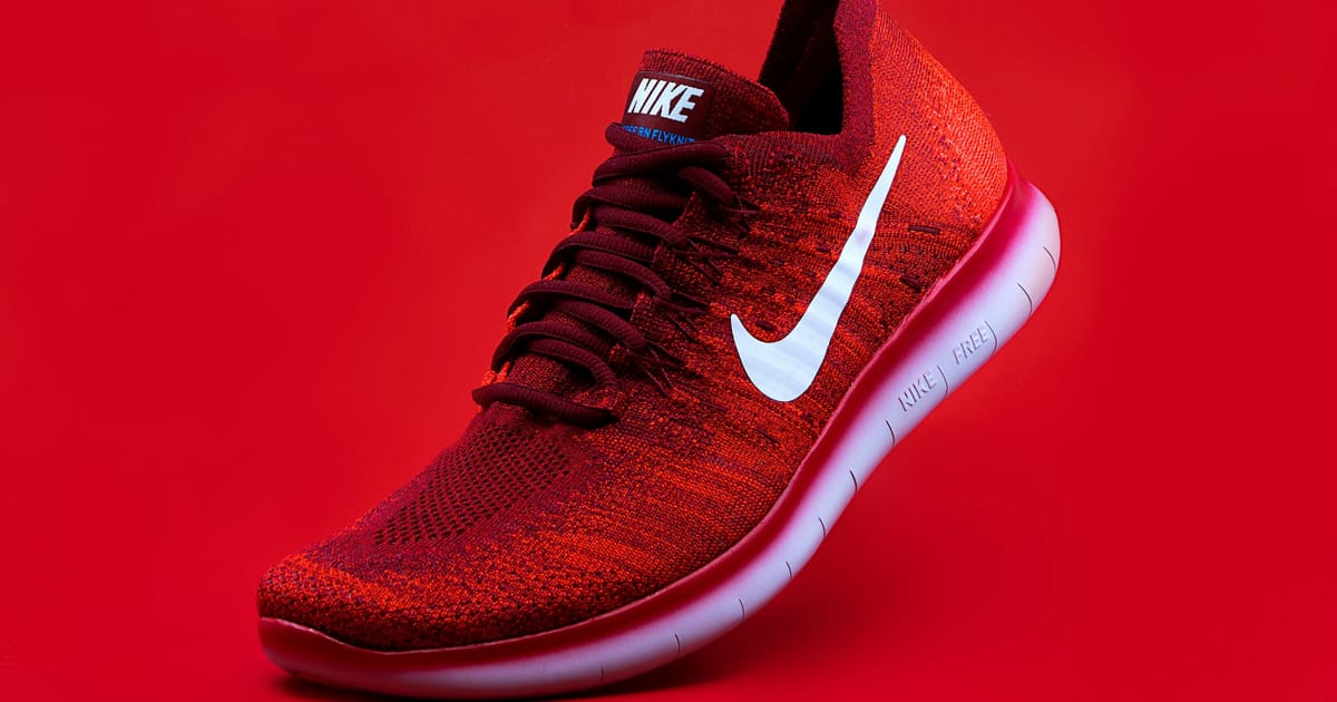
The product page is where a Shopify store makes its money or loses it. Visitors arrive from ads, search and collection pages already interested; the page's job is to answer their questions quickly enough that they buy before they drift away. These are the twelve changes I make most often, grouped by the problem they solve. None of them needs a redesign.
Show the product properly
1. Build an image gallery that sells
Photos do most of the persuading online, because they stand in for picking the product up. Aim for a clean main shot, then detail close-ups, a sense of scale (in a hand, on a person, in a room) and every colourway. On mobile, make the gallery swipeable and show a clear hint that more images exist. Keep the first image light and not lazy-loaded, because it is usually the page's LCP element.
2. Write a benefit-led title and summary
Keep the product name clear and searchable, then use the line beneath it to say what the product does for the buyer. "Merino running tee" is the name; "Stays dry and fresh on long runs" is the reason to buy. Put two or three short benefit bullets above the fold and push the full specification further down.
Remove doubt about price and options
3. Make the price impossible to misread
Show one clear price close to the title. If there is a sale, show the original price struck through and the saving, but do not stack badges until the page looks like a clearance bin. If you offer instalment payments, mention them in one quiet line. And make it clear whether prices include tax, so nobody gets a surprise at checkout.
4. Fix variant selection
Dropdowns hide options. For sizes and colours, use visible buttons or swatches so people can see every choice at once. Grey out sold-out combinations rather than hiding them, switch the main image when a colour is picked, and make the selected state obvious. If a variant is genuinely low in stock, say so. Never fake scarcity; shoppers notice, and it costs you trust you cannot buy back.
Make buying easy on mobile
5. Add a sticky add-to-cart bar
On a phone, the main button scrolls out of view as soon as someone starts reading the description or reviews. A slim bar pinned to the bottom of the screen, with the price and an add-to-cart button, keeps the action one tap away. Show it only once the main button has left the screen, and check it does not cover your chat widget or cookie banner. The principles in my CTA button design guide apply here: one clear action, strong contrast, big enough to tap.
6. Put shipping and returns next to the button
Delivery cost and returns policy are two of the most common reasons people hesitate. Answer them in a line or two directly under the add-to-cart button: when it will arrive, what delivery costs, how returns work. Link to the full policy, but do not make anyone hunt for the basics.
Answer the questions that stop people buying
7. Show reviews where they help
Put the star rating and review count near the title, linked to the full reviews further down. Photo reviews are especially persuasive for clothing and homeware. If you have a lot of reviews, let people sort and filter them. And choose a reviews app that loads lightly; some add a surprising amount of JavaScript for a row of stars.
8. Help with sizing and fit
For anything that has to fit, uncertainty is a return waiting to happen. Put a size guide link right beside the size selector, open it in a drawer rather than a new page, and add fit notes such as "runs small, size up". Listing the model's height and the size they are wearing is simple and effective.
9. Add trust signals, sparingly
Payment icons, a clear guarantee, a visible way to contact a real person and a short line about who you are all reduce risk for a first-time buyer. One compact trust row next to the button does more than six badges scattered down the page.
Keep the page fast and focused
10. Make it fast
Every improvement above is wasted if the product takes four seconds to appear on a phone. Product pages collect the most apps (reviews, upsells, size guides, wishlists, badges), so they are often the slowest template in the store. Check this template's Core Web Vitals specifically, not just the homepage's. My guide to speeding up a slow Shopify store shows how to find which app is costing you.
11. Cross-sell lightly
"Complete the look" or "often bought with" can raise order value, but only when it does not compete with the main purchase. Show a few genuinely related products below the main details, not a popup the moment someone adds to cart. Shopify's product recommendations or a hand-picked list stored in metafields both work; the hand-picked version is usually more relevant.
12. Finish with a short FAQ
Collect the questions your support inbox gets about the product (materials, care, compatibility, delivery times) and answer them in a collapsible FAQ near the bottom of the page. It stops people leaving to find answers, and it gives search engines useful, specific text. It is the same idea as the objection-handling section in the anatomy of a landing page that converts.
How to roll these out
Do not change all twelve at once. Start with the ones that answer questions, such as shipping near the button, sizing help and clearer variants, because they are cheap and remove real friction. Then improve the gallery and add the mobile bar. Change one thing, give it enough traffic to judge, and watch add-to-cart rate and conversion rate rather than gut feel.
Build each change as a reusable block rather than a one-off edit to a single template. With custom Shopify sections your team can edit, your marketing team can add a size guide, an FAQ or a trust row to any product without calling a developer. And design every change on a phone first: on the stores I work with, that is where most shoppers are. The reasoning is in mobile-first design.
Getting traffic but not sales? Send me a product page and I will tell you which of these twelve I would change first. You can also browse stores I have built.