
CTA Button Design: What Actually Makes People Click
Your call to action is the smallest element carrying the biggest job. Wording, placement, size, states, and the mistakes that quietly cost conversions.
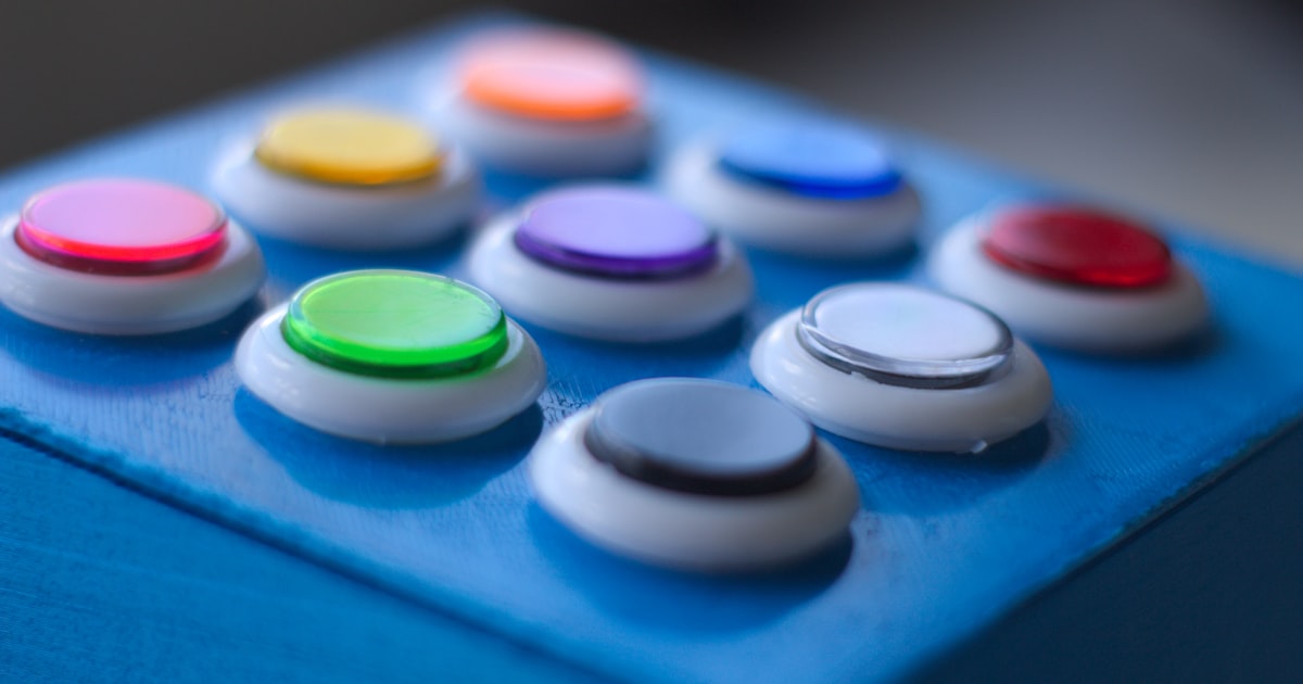
A call-to-action button is where every other decision on the page gets tested. Good copy, clear design, and fast loading all funnel into one small rectangle. It is also the element most often designed last and least.
Wording: name the outcome, not the mechanic
"Submit" describes what happens to the form. "Get my free quote" describes what happens to the visitor. First person tends to outperform second — "Start my project" over "Start your project" — because it reads as the user's own decision. Keep it to two to four words, and make it specific enough to stand alone out of context.
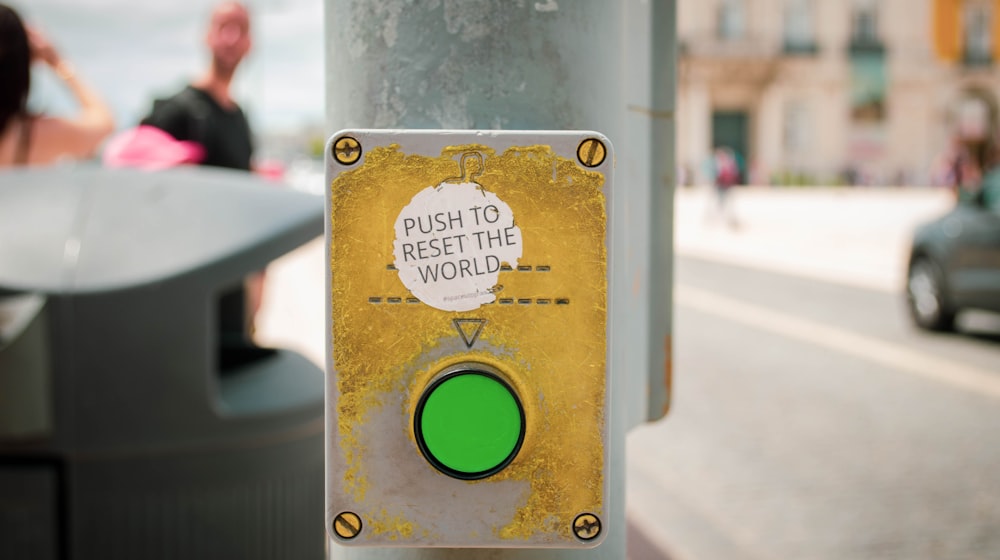
One primary action per view
Two equally-weighted buttons is a decision the visitor did not ask to make. Have one primary, and demote everything else to a secondary or text style. If two actions genuinely matter, make the second visually quieter — outline instead of filled, or a plain link.
Make it obviously a button
Flat design went too far. Buttons need a fill, adequate padding, and enough contrast against their surroundings that nobody has to hover to find out whether it is clickable. Ghost buttons on photographic backgrounds are the worst offender — unreadable and easy to miss.
Size and position
- Minimum 44px tall on touch devices, with real horizontal padding.
- Full-width on mobile is fine and often better.
- Surround it with space — proximity to other elements steals clicks. See why white space matters.
- Repeat the same CTA down long pages, but keep it the same action.
Build all five states
Default, hover, focus, active, and loading. Focus is the one people forget, and it is the one keyboard users depend on — never remove the outline without replacing it with something visible. The loading state is what stops double submissions, and the press feedback is the micro-interaction covered in micro-interactions.
Reduce the perceived risk right beside it
A short line under the button removes the last hesitation: "No card required", "Reply within one working day", "Takes about 2 minutes". This tiny piece of copy consistently earns more than any colour change.
Colour matters less than contrast
The green-versus-red debate misses the point. What matters is whether your button is the highest-contrast element in its area. If your brand colour is already everywhere, the accent colour is what your primary button should use — the 60-30-10 logic from colour theory for web design.
Use the right element
A link that navigates is an <a>. A control that performs an action is a <button>. A <div> with a click handler is neither: no keyboard support, no announced role, no middle-click to open in a new tab. It is a five-second fix and part of the accessibility baseline.
Common conversion leaks
- The primary CTA below the fold on a page whose whole job is that CTA.
- Buttons that look identical to non-clickable badges.
- A CTA leading to a form with eleven fields — see form UX.
- Disabled submit buttons with no explanation of what is missing.
- A button that does nothing visible for two seconds after being pressed.
If your traffic is fine and your enquiries are not, the CTA is the first place I look. Ask me to look at yours.