

Figma to Code: A Handoff Workflow That Does Not Waste Anyone's Time
Most design-to-development friction comes from the same handful of gaps. Here is the workflow I use to close them before a single component gets built.
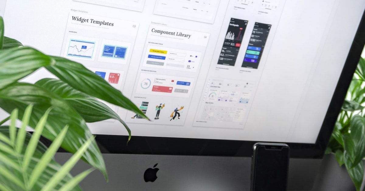
The Figma-to-code handoff is where projects quietly lose a week. Not because designers or developers did anything wrong, but because the file answered the easy questions and left the hard ones to a Slack thread. A good handoff is mostly about deciding things before they become interpretation.
What developers actually need from a file
- Every state, not just the happy path — hover, focus, active, disabled, loading, error, empty.
- The narrow width — a mobile frame for every page, not just desktop plus optimism.
- Real content extremes — the longest product name, the shortest testimonial, a two-line heading.
- Spacing that comes from a scale, so 23px does not need a decision.
- Named variables for colour, type, and spacing rather than raw hex values.
Half of the questions that come back during a build are one of those five items missing.

Agree the token names before the components
If the Figma variables are called surface, surface-raised, and text-muted, and the CSS custom properties use exactly those names, translation stops being translation. Colours named by role instead of appearance also make theming possible later — the argument in designing a dark mode properly and colour theory for web design.
Use auto layout the way flexbox works
Auto layout maps almost directly onto flexbox. A frame built with auto layout, real constraints, and sensible resizing behaviour tells a developer how it should respond at every width. A frame built with absolutely positioned rectangles tells them nothing, and they will guess.
Build components as a system, not as screens
Twenty pixel-perfect screens are worth less than a documented set of twelve components plus a layout grid. Screens show one arrangement; components show the rules. This is also what stops the fifth page from looking like a different website — see wireframes, mockups and prototypes for where each fits in the process.
Annotate behaviour, not appearance
Developers can read the spacing. What they cannot read is intent: what happens when this list is empty, where does this link go, is this section reordered on mobile or hidden, does this animate on scroll or on load. A short note beside the frame prevents a day of back-and-forth.
Review together, twice
One walkthrough before development starts — designer explains, developer asks the awkward questions, both agree on what is out of scope. One review at 80% built, in the browser rather than in Figma, because the browser is the real medium. Anything after that should be a small list, not a redesign.
Accept that the browser is not Figma
Text renders differently, images compress, scrollbars take space, and a font stack has a fallback. Pixel-chasing the last 2% burns budget that would be better spent on states, performance, and accessibility. Agree tolerances early and the whole review gets calmer.
Two habits that pay for themselves
First, design with the real data and the real photography — placeholder text hides every layout problem you are about to find. Second, keep the performance budget in the design conversation, because the hero decision is a performance decision, as covered in the ten performance mistakes I see most.
I work from Figma files every week, including inherited ones. See recent builds or send me your file for a feasibility read.