

Designing a Dark Mode That Does Not Hurt to Read
Dark mode is more than inverting your colours. The specific mistakes that make dark themes unreadable, and how to avoid all of them.

Dark mode is now an expectation rather than a feature. It is also the place where most design systems fall apart, because a dark theme is not a light theme with the colours flipped — it follows different rules.
Never use pure black
Pure black backgrounds with pure white text produce painful contrast and visible halation, especially on OLED screens at night. Use a very dark neutral around #0f0f11 to #18181b, and soften your text to roughly 90% white rather than 100%. Your eyes will thank you within about ten seconds of reading.
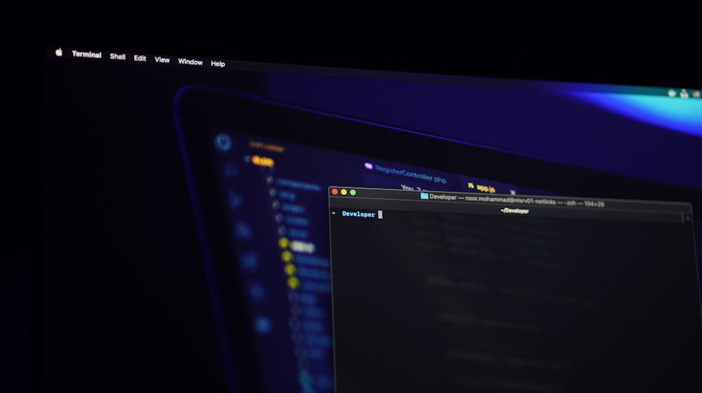
Elevation works in reverse
In light themes, raised surfaces get shadows. In dark themes shadows are nearly invisible, so elevation comes from surfaces getting lighter as they come forward. Define three or four surface levels — background, card, raised card, popover — each a step lighter, and stop reaching for shadows.
Desaturate your brand colours
A saturated brand blue that looks sharp on white will vibrate uncomfortably on a dark background. Reduce saturation and raise lightness for the dark variant. This is why palettes built in a perceptual space are easier to theme — see colour theory for web design.
Recheck every contrast ratio
Contrast is not symmetrical. Mid greys that pass on white frequently fail on dark, and the usual casualties are placeholder text, disabled states, borders, and secondary labels. Re-audit the whole theme rather than assuming — the standards are in why accessibility is not optional.
Handle images and logos
Transparent PNGs with dark artwork disappear. Screenshots with white backgrounds glare. Options: ship a light and dark variant of the logo, add a subtle surface behind screenshots, and slightly reduce image brightness in dark mode with a filter. Do not invert photographs.
Implement it with tokens, not overrides
The maintainable pattern is CSS custom properties defined once per theme, with components referencing only the tokens:
:root { --surface: #ffffff; --text: #18181b; }
[data-theme="dark"] { --surface: #131316; --text: #e8e8ea; }
If you find yourself writing a second set of component rules for dark mode, your colours were named by appearance rather than by role. That is a token problem, not a theming problem.
Respect the system, but let people choose
Default to prefers-color-scheme so first paint matches the operating system, then offer an explicit toggle and remember the choice. Two details prevent the most complaints: set the theme before first paint to avoid a white flash, and give <body> an explicit background so nothing shows through.
When dark mode is not worth it
If your site is a five-page brochure with a light brand identity, a dark theme doubles your design surface for little return. It earns its place on content-heavy sites, dashboards, developer tools, and anything people use for long stretches or at night. Deciding that honestly is the same cost-benefit thinking as the true cost of a custom website.
Adding dark mode to an existing site is mostly a token audit. Ask me what yours would involve.